Jon Ewell
I am a creative director, art director and multimedia producer. I currently work for a large science corporation but I still do freelance projects in my free time. I produce multimedia content: video, motion design, social media experiences, illustration (traditional, digital, vector, photo composite) digital design, photography (lifestyle, culture, headshots, portraits), audio production (podcasts, radio shows, spatial audio) and virtual production (webinars, remote video interviews and more). This page shows a wide range of projects so you can see examples of various things I can do.
This is video I produced and animated in 2023.
Here are some recent illustration projects in many different styles. See the illustration page here.
This was a quick pre-viz I made of a nightclub/restaurant design for an investment presentation.
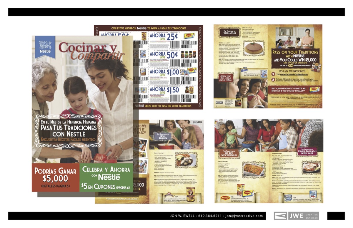
Direct-Mail Brochure for Nestle
I designed this booklet in English and Spanish through an agency for Nestle. I was involved with the planning and strategy, design and mechanicals for print.
Brand Talk
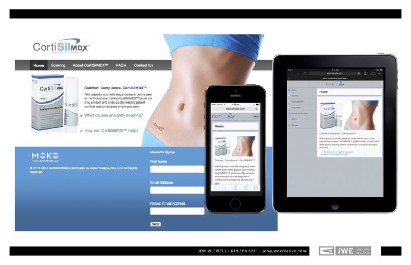
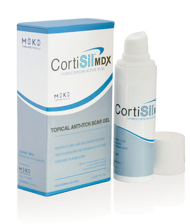
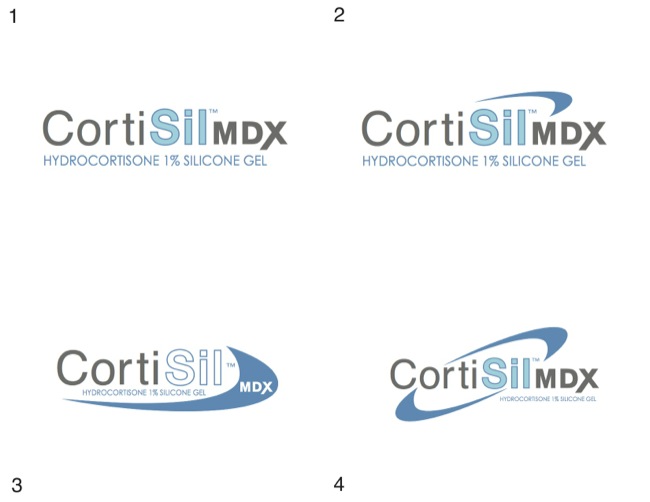
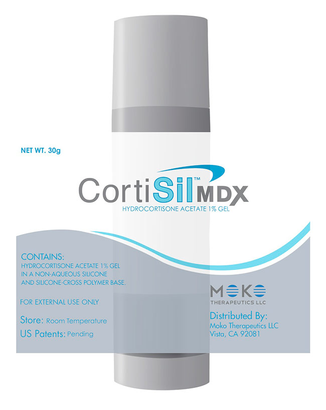
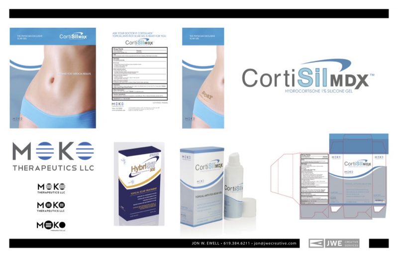
I was hired to rebrand this product and the parent company. I also redesigned their collateral, packaging, website and email communications.
Brand Talk

Brand Talk
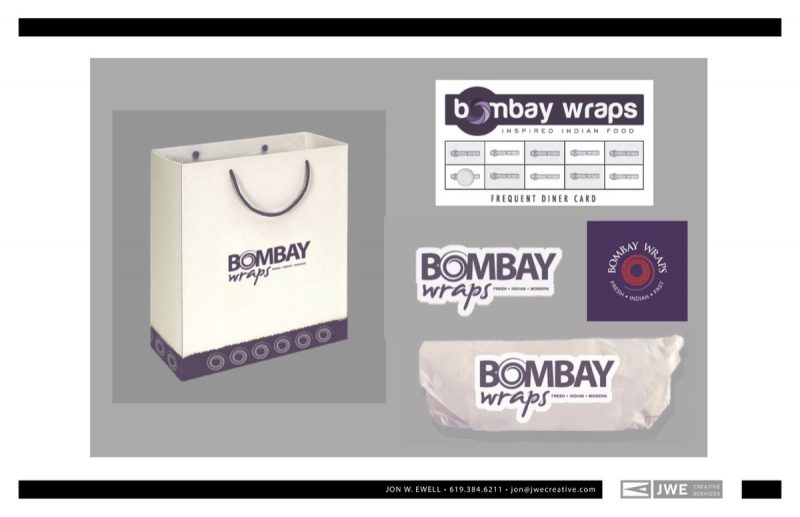
These are retail branding and packaging concepts designed for an agency.
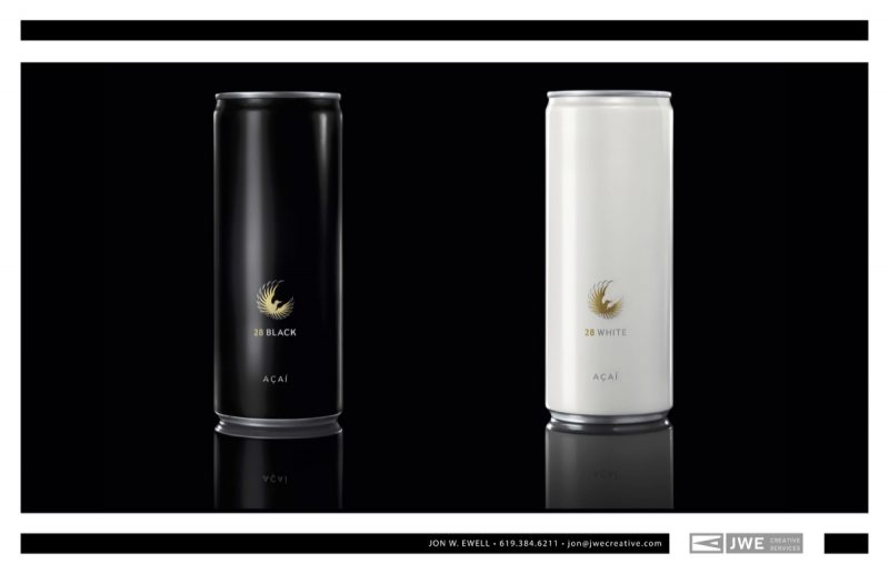
I love making dramatic images using photoshop. This was a project contracted by an agency for 28 Black.
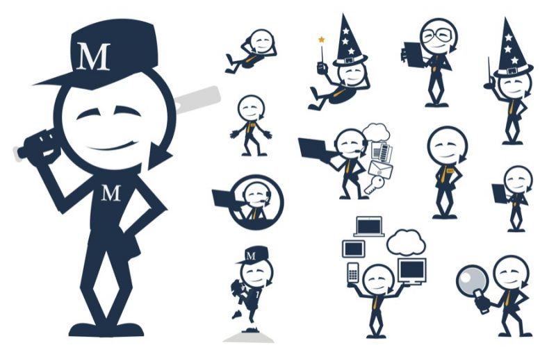
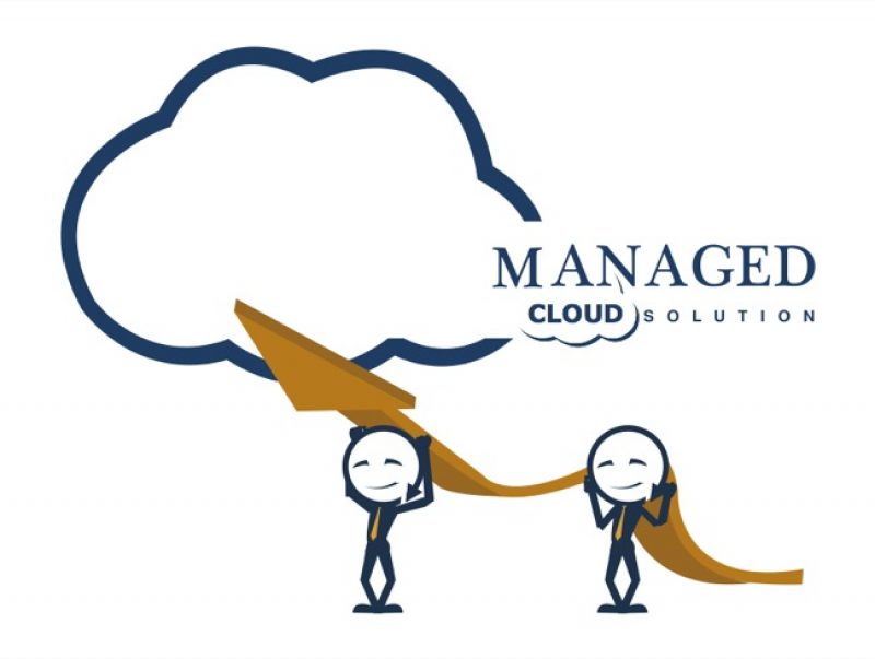
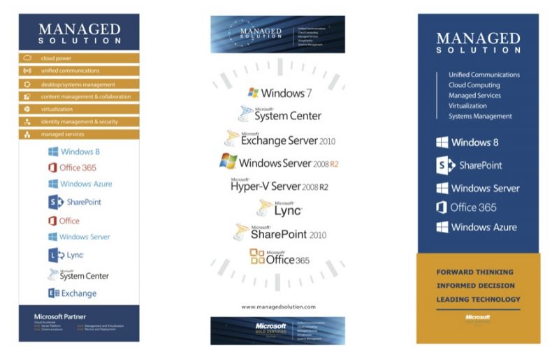
This company offers Microsoft cloud services and I was hired by their CMO to develop design, infographics and illustrations. I designed a fun mascot named “Manny” whose head was made up using the shape from their logo. As you will see in the examples below, Manny wore many hats and could easily beat you in baseball, or he could service your account.
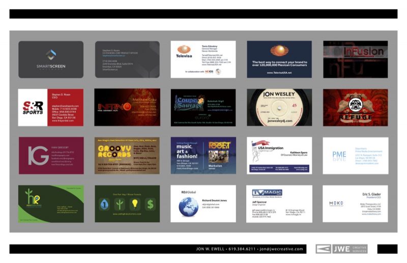
I’ve designed a bunch of business cards over the years. Here are a few examples.
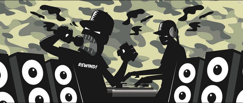
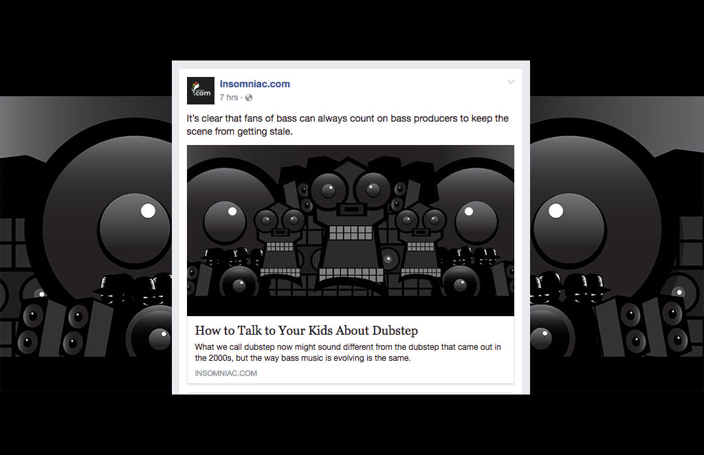
This was an illustration for a feature article about Drum and Bass music for Insomniac. See the article here.
If you want to experience the music, this mix by R.A.W. is available for streaming on Mixcloud.
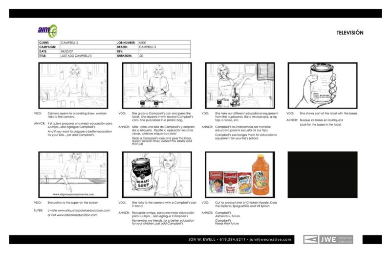
This was a storyboard for a 30 second spot for Campbell’s. The agency I worked for specialized in marketing for the Latino market, so all of our creative was in English and Spanish.
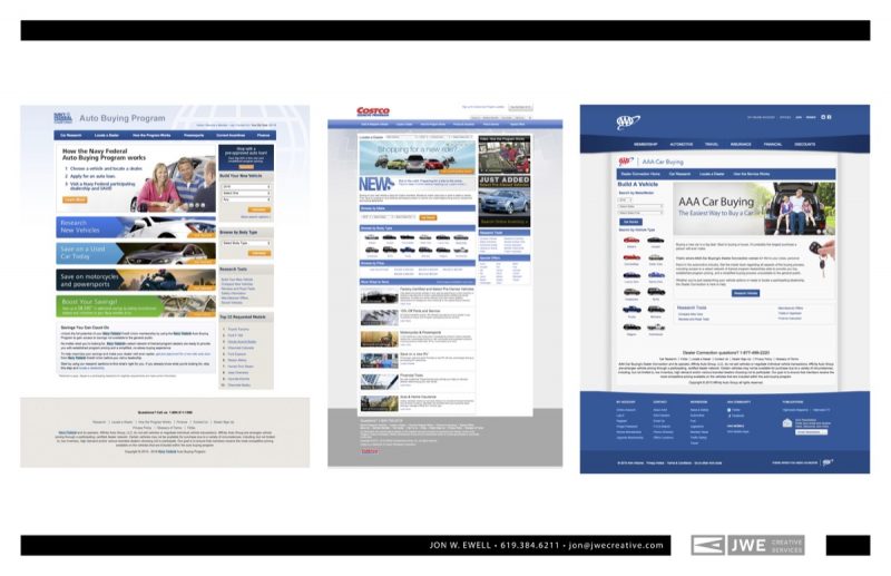
These are some examples of corporate web sites I’ve designed. I worked for an agency that specialized in marketing for the automotive industry. I worked with a team to develop the Costco and Navy Federal sites, and I designed the AAA site on my own.
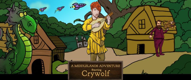
This was one of many illustrations I created to promote the Middlelands Adventure music festival produced by Live Nation/Insomniac. We developed a sort of Madlibs interactive storytelling questionnaire and then I illustrated what the readers came up with. We ended up with some very strange stories and it was a lot of fun. We used these for social media posts and custom Snapchat lenses.
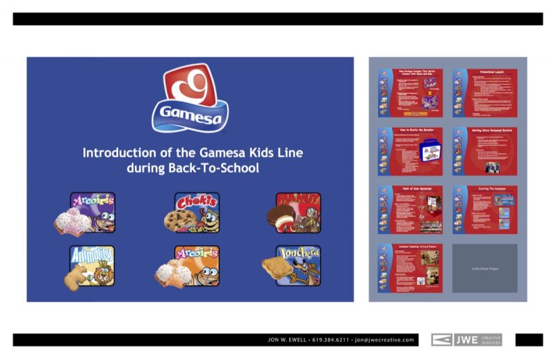
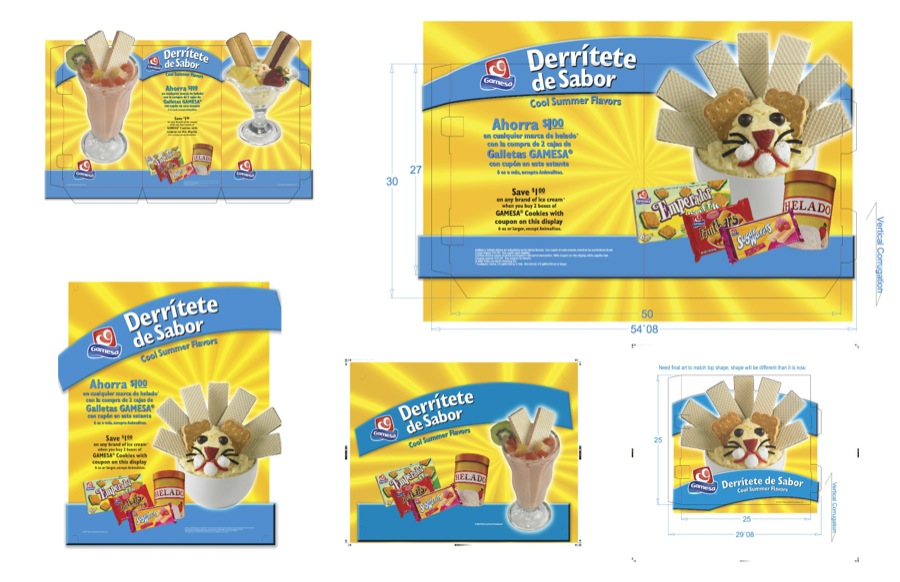
I’ve designed hundreds of Powerpoint and Keynote presentations over the years but this was one of my favorites. Gamesa is a PepsiCo. cookie brand for the Latin American market.
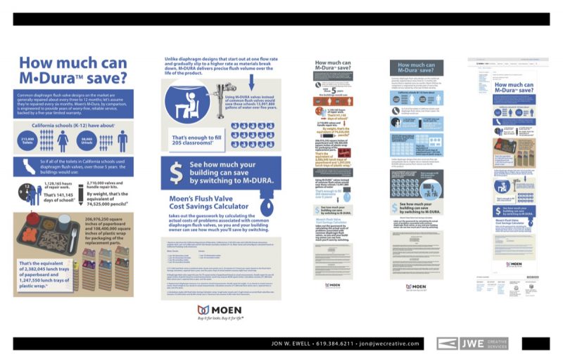
This is an infographic I designed and illustrated for a Washington DC ad agency for Moen’s M-Dura line.
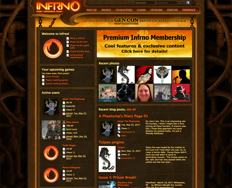
This was a wireframe web site I designed for a gaming social network.
This was another illustration for an Insomniac featured article and for social media.
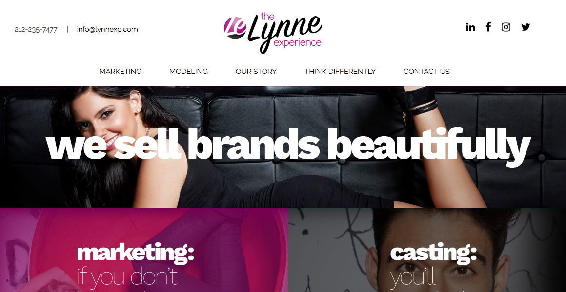
This was a brand design for a New York experiential marketing agency.
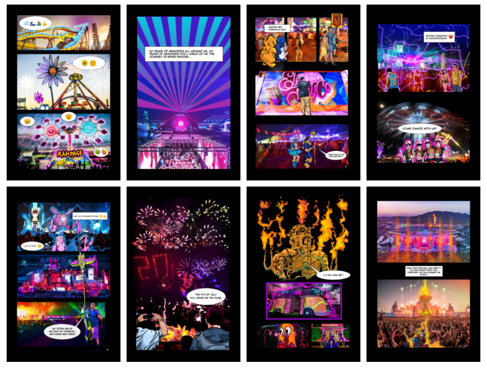
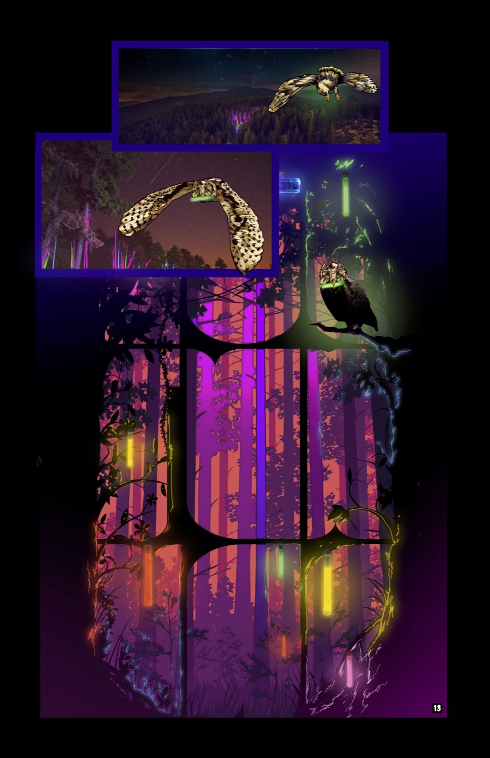
This was a comic book I illustrated for the 20th anniversary of the EDC music festival. I originally wrote an entire graphic novel story but they decided they wanted a simple narrative so most of the copy came from the content team. This was a fun project and I also made one for their Nocturnal Wonderland event and another for Escape Halloween.
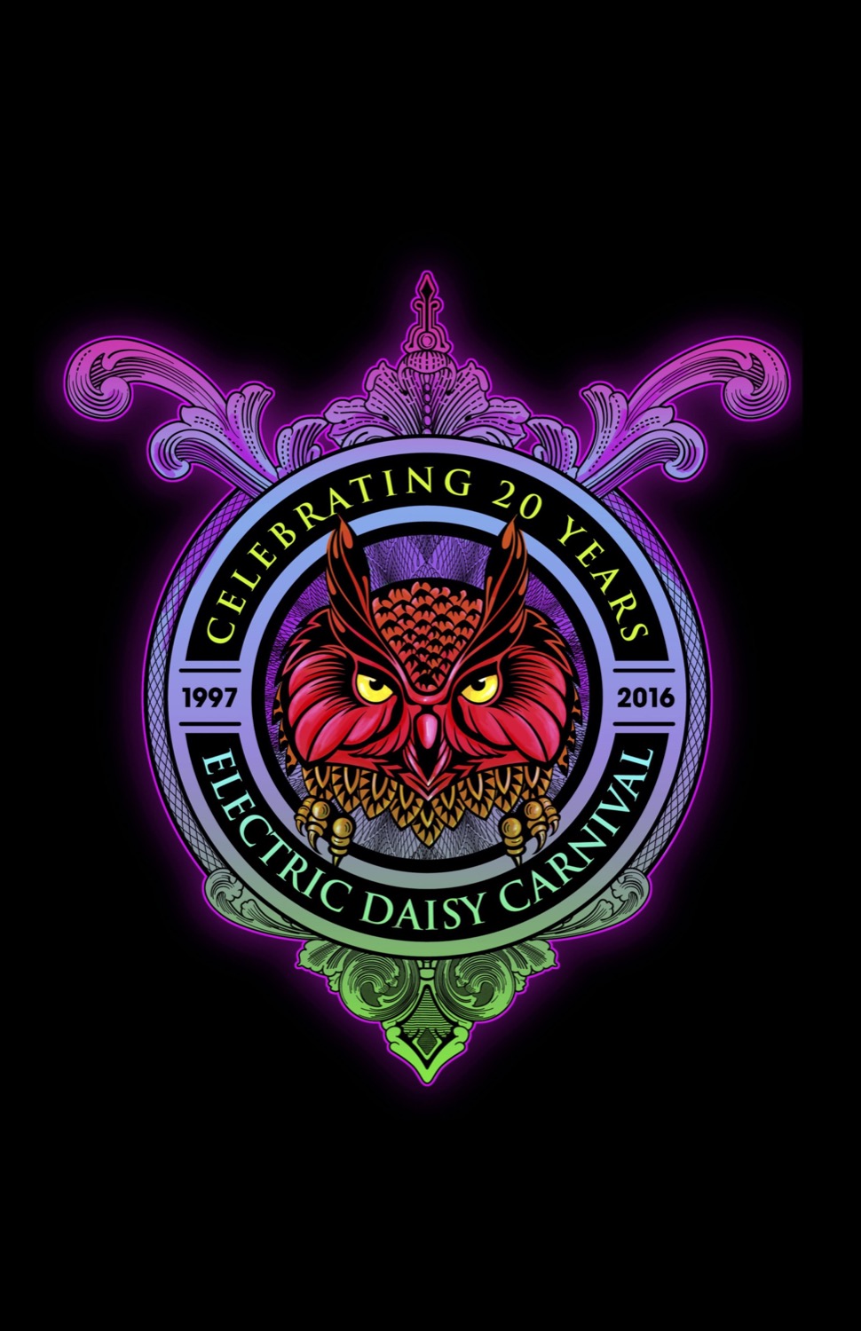
This was a logo treatment I made along with the final panel of the comic book that was used to promote the next event. The company uses an owl as a mascot so we developed a continuation of the theme for each event. The glow stick is a symbol for rave culture so it was fun to use it as a cool lighting effect. See the digital comics here.
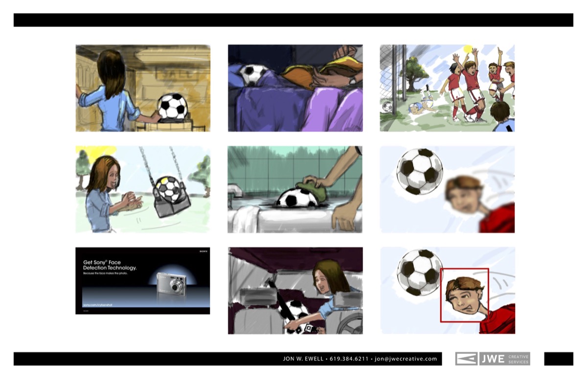
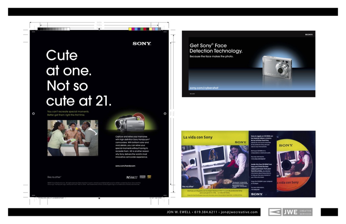
This was a storyboard I illustrated for a Sony commercial. You can tell this was from many years ago since it was when Sony introduced face-detection technology. It was a fun project for me so I keep it in my portfolio. The creative director I worked for at the time wanted a really loose, sketchy style, so this one was done loosely. You can see a clip of the commercial below.
00:00
00:31
00:00
00:31
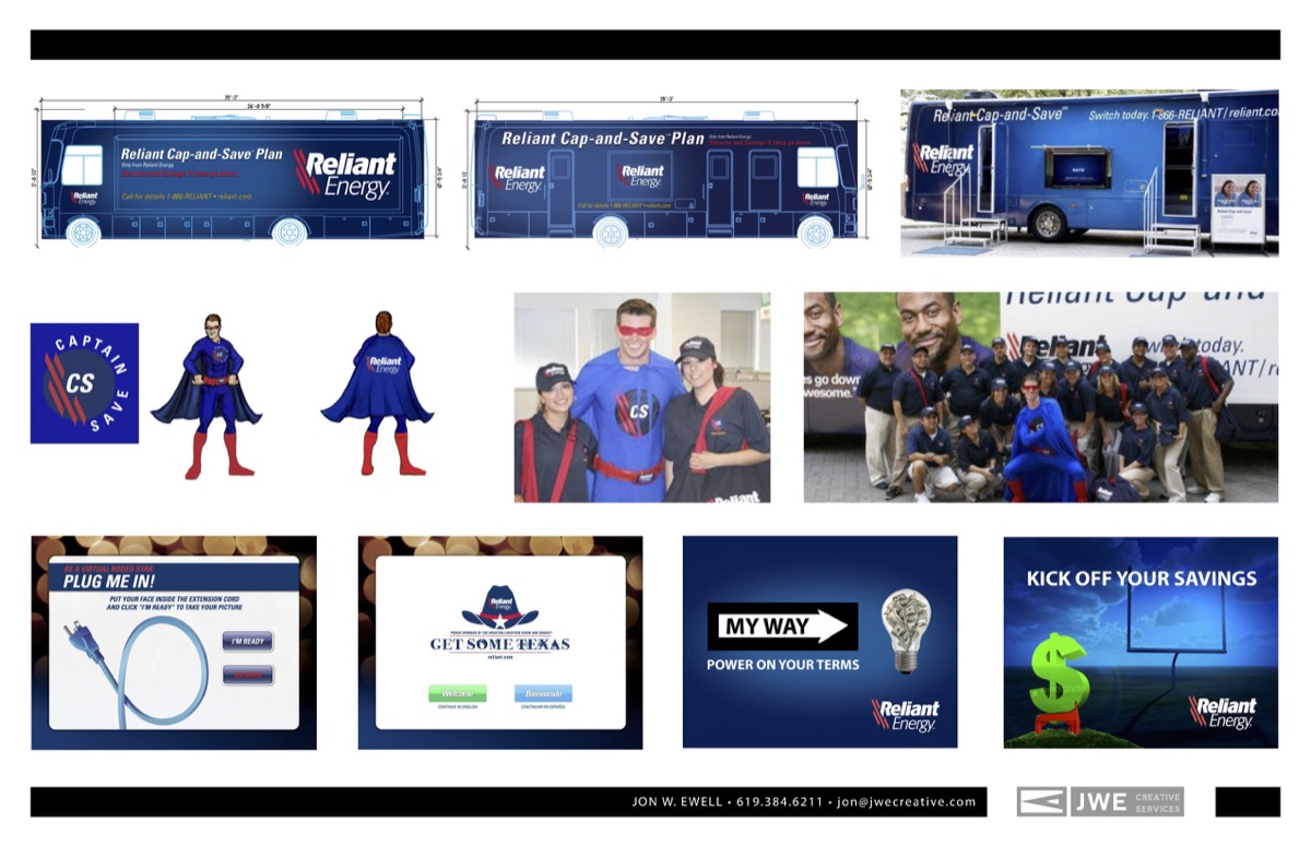
This was a vehicle wrap and a mascot I designed for Reliant Energy. Our agency was contracted to develop several experiential marketing events for the brand’s Cap and Save program. We developed a mascot named “Captain Save” and he appeared in costume at the events. I’ve designed a bunch of vehicle wraps but this was my first motor home. I also included some concept art for several campaigns and screenshots of an interactive kiosk display panel we designed.
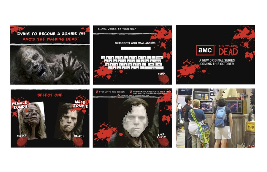
This is another old project but it’s one of my favorites. Our agency was hired to produce an interactive, video promotion for the premier of The Walking Dead (now wrapping up the series after 11 seasons). Our developer coded a tradeshow kiosk to take a photo of a booth visitor. Then their face would appear in a video trailer for the show. That video clip was emailed to the user so they could share it on social media. This was very high-tech at the time (2010) and it was a very popular promotion. I was involved with the kiosk graphics design and coding the email automation to pull the clip from the database and email a unique video with the user’s face in the trailer.
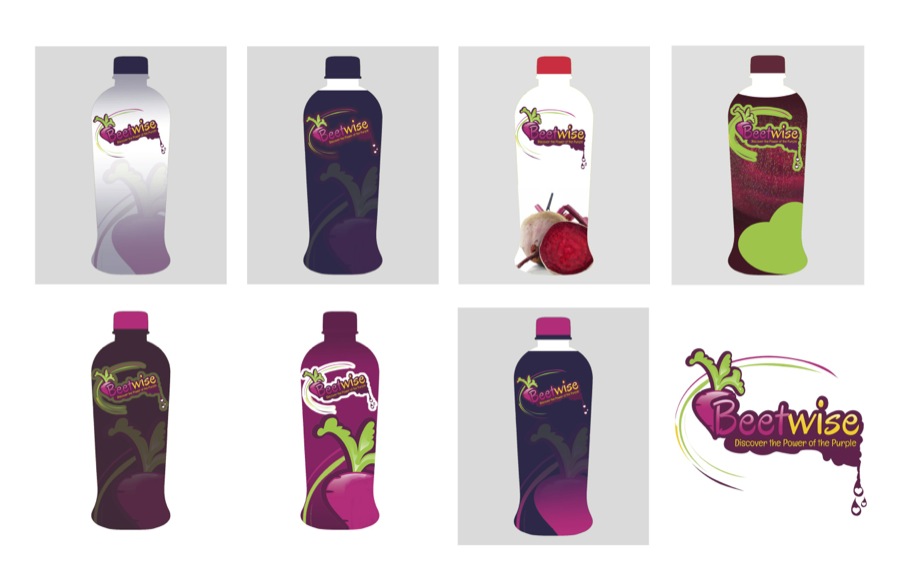
These are some packaging concepts for a drink company. I don’t think this product ever made it to market since it was made of beets. It was fun working on the design though.
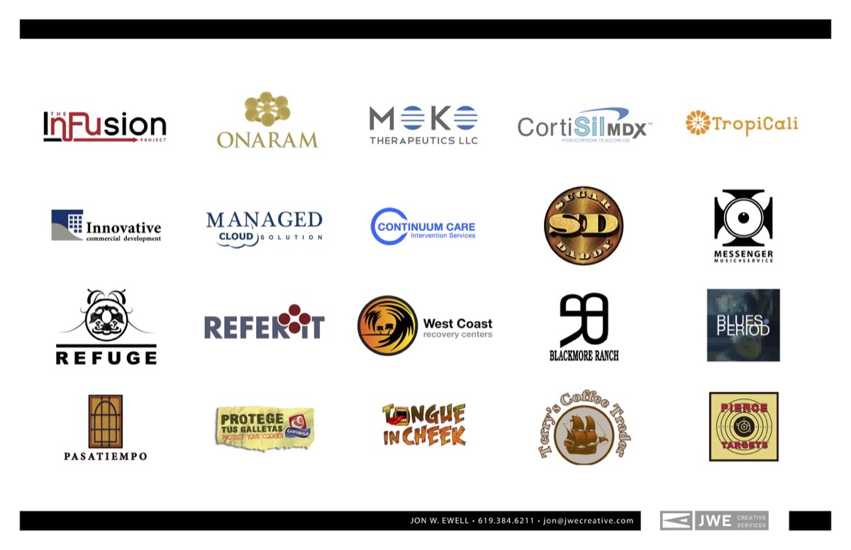
I’ve always loved designing logos and brands. I’ve done so many over the years it’s hard to keep track but these are some that I managed to keep.
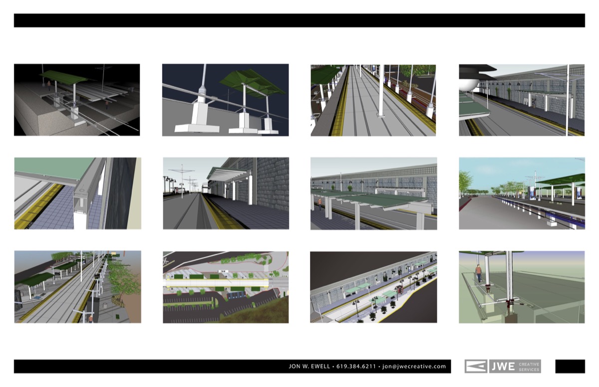
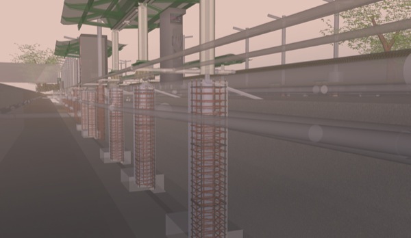
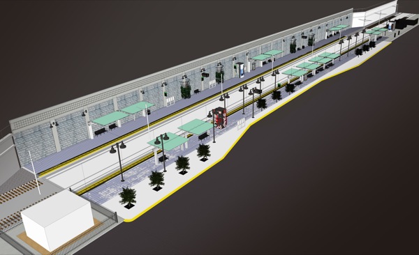
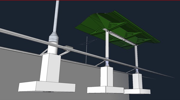
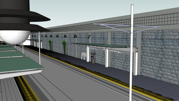
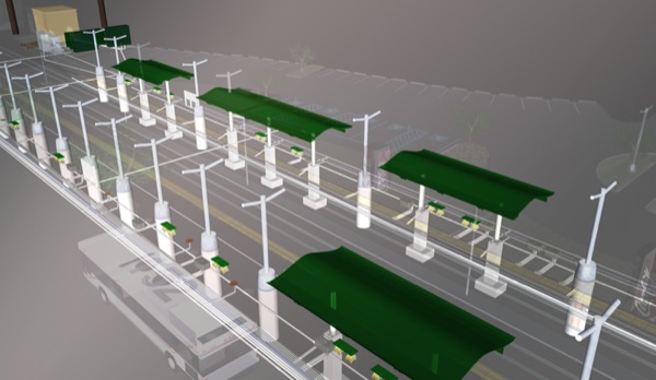
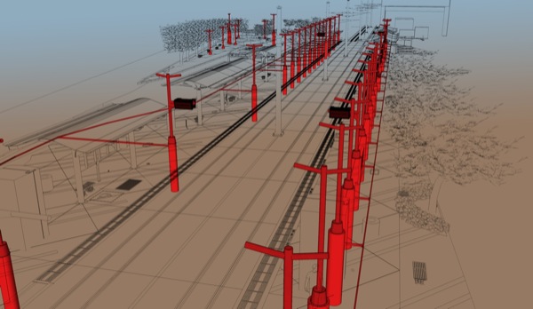
This is another favorite project of mine. Years ago a law firm from Florida contacted me (back when I was in the top five of Google search results for “illustrator San Diego”) and asked me to illustrate two San Diego trolley stations for a lawsuit between the city and the developer. I convinced them that they should have me create a full scale 3d model so they could pull any angle they wanted and they loved that idea. I spent about six months working on this full time. I built it at 100% scale using Sketchup (formerly owned by Google).
This is another set of creative for Sony. I was involved with design and storyboards for the “not so cute at 21” commercial.
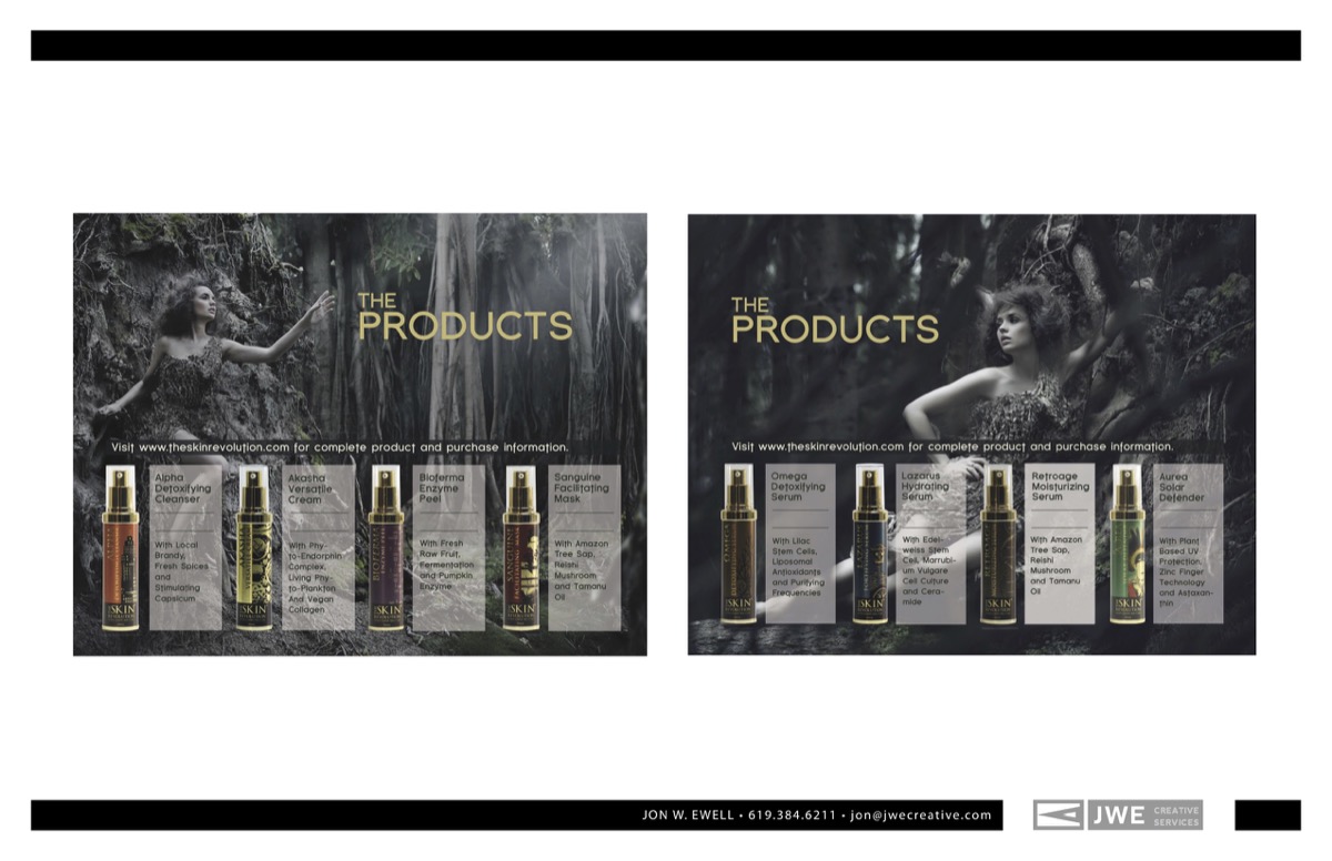
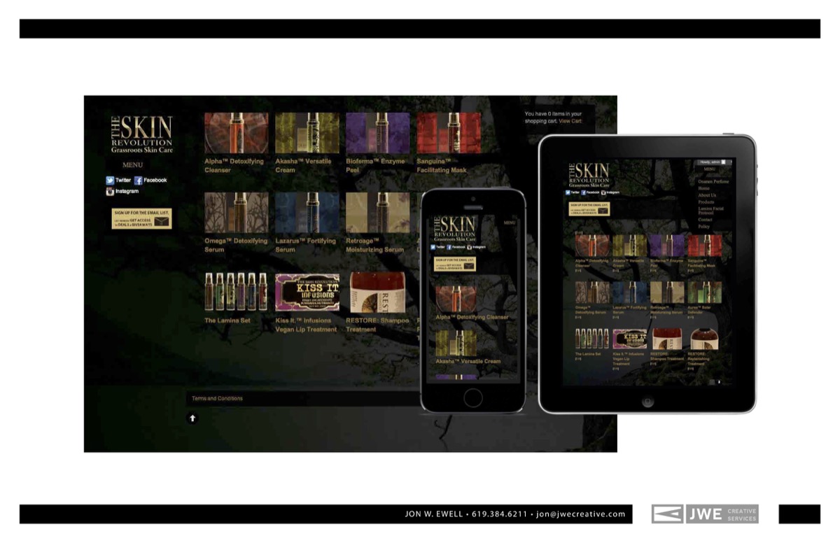
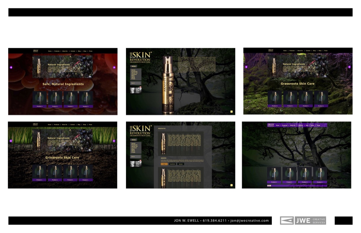
These are designs for an amazing skin-care line called The Skin Revolution. I worked with the creator to design a web site and print collateral.
These are production mechanicals for large format retails displays I designed for an agency. I was also involved with art directing the photoshoot with the food stylists.
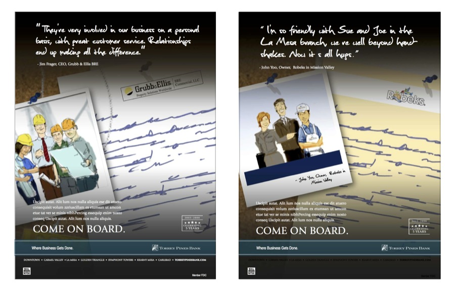
This is concept art I designed and illustrated for a local San Diego marketing agency for a new business pitch.
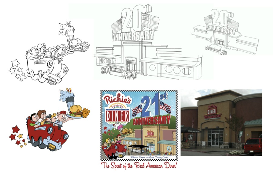
I used to design t-shirts when I worked for a promotional products company. I would do illustrations, design and I would handle the color separations for screen printing. This was a project for the anniversary of Ritchie’s Diner in Temecula, CA. If you are ever passing through, stop by for some of the best fried chicken in the state.
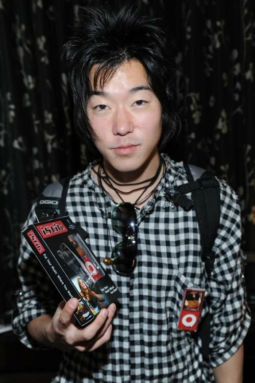
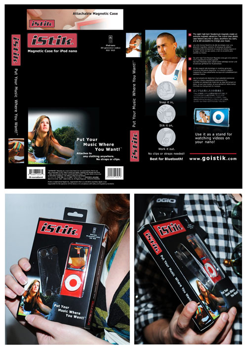
I’ve also designed a lot of packaging over the years. I keep this one in my portfolio because they sent photos of various celebrities of the time holding the product. This was a first for one of my designs so it’s still one of my favorites.
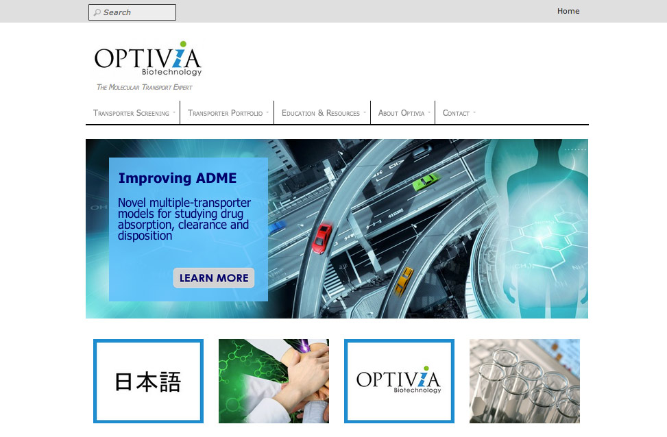
This was a web site I designed for a Bay Area biotech company. I designed the website and moved their files to a new server, reset dns for the domain, and reconfigured their mail servers–so it was a big project. This company was acquired by another so it doesn’t exist any more.
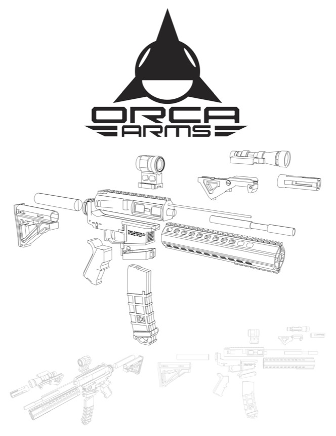
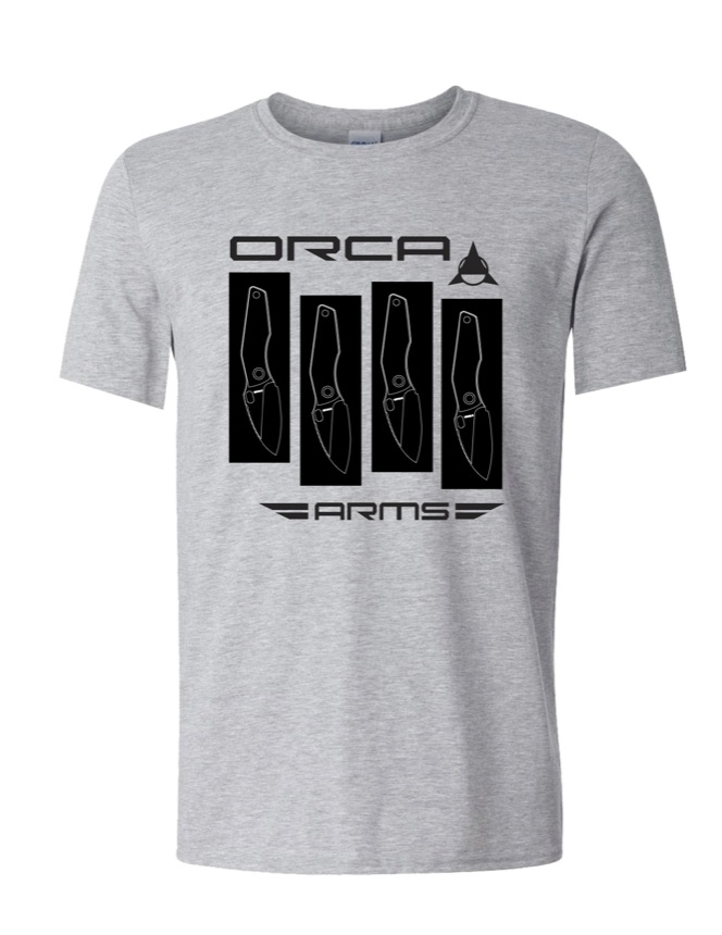
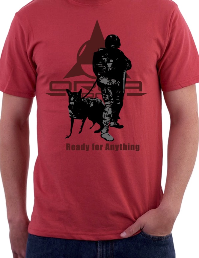
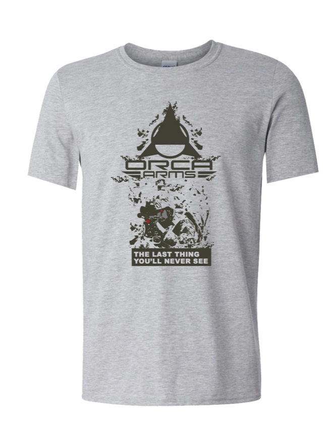
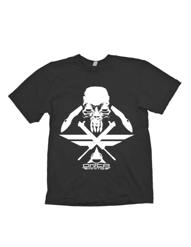
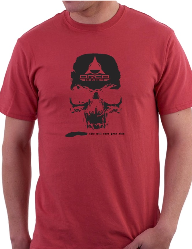
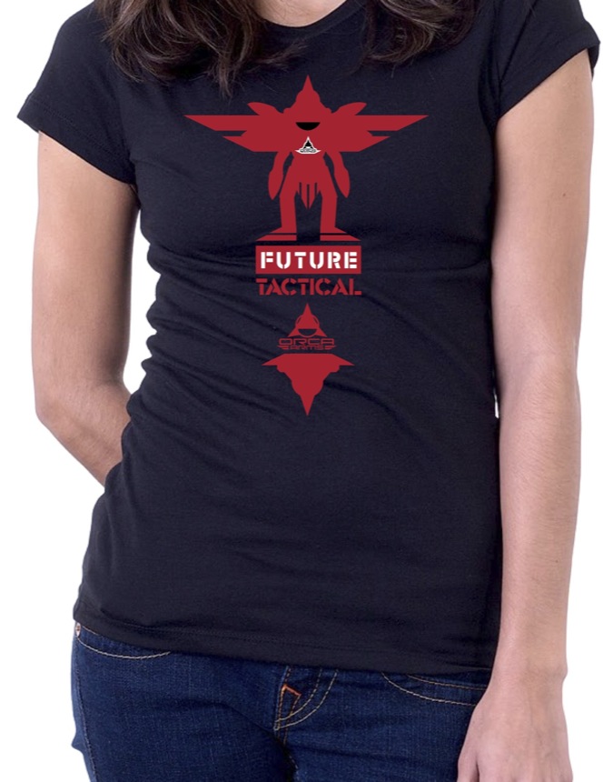
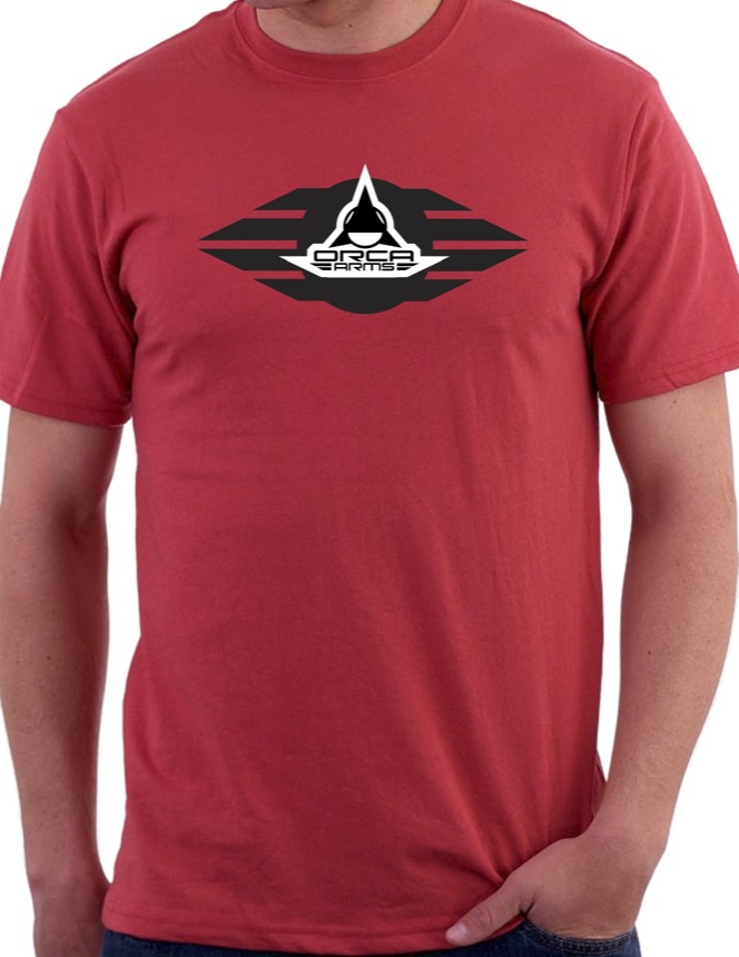
This was a series of t-shirts and graphics I created for a local arms company.
